Work Collection
Branding Blog
Brand Identity


Mytravaly Worldwide. 11-2021
Overview
Here is my first identity for MyTravaly, showcasing our dedication to unique experiences and memorable adventures. We connect people with local cultures and hidden gems, inspiring wanderlust and encouraging exploration.
Overall
focus on creating a modern, clean, and easily recognizable brand identity that communicates the brand's core values and offerings effectively.
Approach
key elements of the design approach:
Simplicity: The use of a clean and straightforward design with the text "MyTravaly" and "ALLTHINGS TRAVEL" suggests a focus on simplicity and clarity. This helps in making the brand easily recognizable and memorable.
Typography: The choice of typography is crucial in brand identity. The designer likely selected a modern, sans-serif font to convey a contemporary and professional image.
Color Scheme: Although the specific colors aren't described, minimalist designs often use a limited color palette to maintain a sleek and cohesive look. The colors chosen would likely reflect the brand's values and appeal to its target audience.
Iconography: The letter "R" with a superscript "7" could be a unique brand symbol or logo mark. This kind of distinctive iconography helps in creating a strong visual identity that stands out.
Tagline: The inclusion of "ALLTHINGS TRAVEL" as a tagline suggests that the brand aims to be comprehensive in its offerings, covering all aspects of travel. This tagline reinforces the brand's positioning in the travel industry.
Balance and Alignment: The layout appears to be well-balanced, with elements aligned in a way that is visually pleasing and easy to read. This contributes to a professional and polished appearance.
IV Drip Package

IV Drip Package Overview
The branding approach for Clara Clinic Cambodia IV drip package focuses on minimalism, clarity, and a modern aesthetic. Key elements include a clean, minimalist design, a white and neutral color scheme, modern typography, and simple, symbolic imagery. The messaging emphasizes purity and immediacy, targeting health-conscious consumers. The packaging is functional and visually appealing, aiming to convey trust and professionalism.
Approach
key elements of the design approach:
Minimalist Design: The use of simple, clean lines and a straightforward layout suggests a minimalist approach. This helps in creating a professional and uncluttered look, which is often associated with health and wellness products.
Color Scheme: The color scheme likely includes white and possibly other soft, neutral tones to convey cleanliness, purity, and a sense of calm. White is often used in medical and wellness branding to suggest sterility and trustworthiness.
Typography: The choice of typography is probably modern and sans-serif, which aligns with the minimalist theme and ensures readability. The font choice would be clean and straightforward to reflect the brand's focus on health and wellness.
Imagery and Icons: If there are any images or icons, they are likely to be simple and symbolic, perhaps representing health, vitality, or medical care. This could include abstract representations of droplets, veins, or other health-related symbols.
Brand Messaging: The text "NOW WHITE" (assuming it's a typo and meant to be "NOW WHITE") might be part of a larger brand message emphasizing immediacy, purity, or a new beginning. The repetition could be used to reinforce the brand's commitment to these values.
Packaging Design: The packaging is likely designed to be functional and aesthetically pleasing, with a focus on user experience. This could include easy-to-open features, clear labeling, and a design that stands out on shelves while maintaining a clean look.
Target Audience: The branding is probably aimed at health-conscious consumers who value simplicity, transparency, and effectiveness in their wellness products. The design would appeal to those looking for a modern, trustworthy solution for their health needs.
Brochure


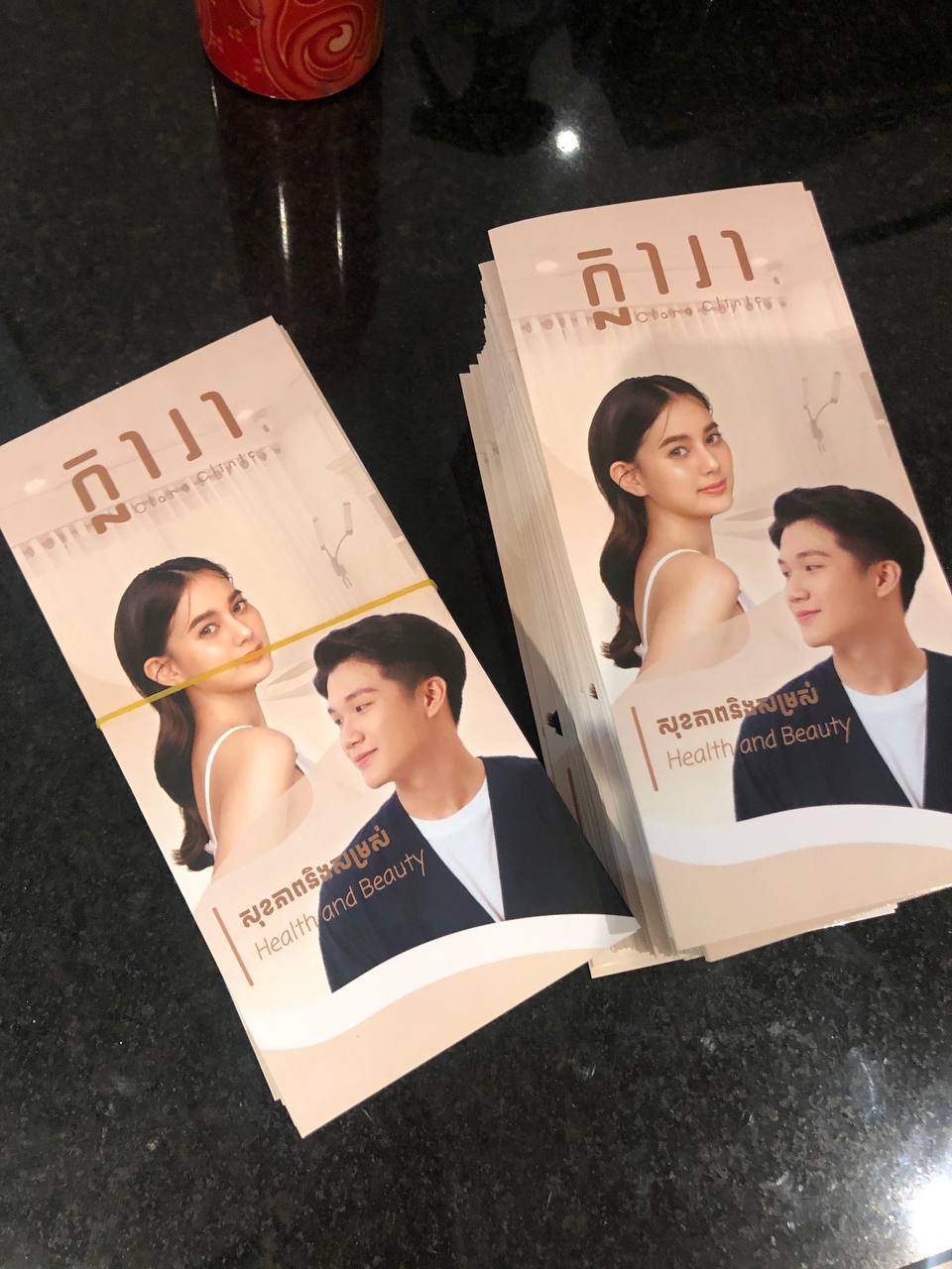
Overview
I designed the CLARA Clinic Cambodia brochure as a professional and visually appealing marketing tool to promote the clinic’s health and beauty services. The brochure uses high-quality images, clear text, and a modern design to attract and inform potential clients.
Approach
Approach:
Target Audience: I tailored the design for people in Cambodia looking for health and beauty services, including skincare and wellness treatments.
Design: I created a clean, modern layout with soothing colors and professional fonts to reflect the clinic’s brand.I included high-quality photos of the clinic, treatments, and happy clients to build trust and showcase results.
Content: I highlighted the clinic’s key services and their benefits in a clear and engaging way.I added a strong call-to-action, like “Book Now for a Free Consultation!” to encourage clients to take the next step.
Branding: I ensured the brochure aligned with the clinic’s branding by using their logo, colors, and messaging consistently.
Distribution: The brochure was designed to be distributed at the clinic, partner locations, or events to attract new clients and build awareness.
What More ?
Please connect to my personal Email.
© 2023 by Salyna Chhorm
(+49) 17660034858
Chhormsalyna@gmail.com